Reality AI Lab is reimagining the future of work and learning with intelligent digital workers. Marvel, its AI-powered teaching assistant, supports educators by simplifying lesson planning, content creation, and classroom management
I led creation of Marvel’s design system from 0→1. By standardizing components and building a shared library, I helped streamline workflows, foster better collaboration, and ensure consistent, scalable design across the product

When I joined Reality AI Labs, I observed several challenges that were affecting the efficiency of our design and development process:-
I had an opportunity to build a scalable design system that serves as a single source of truth for components, patterns, and styles. By integrating design tokens and code snippets into the Figma file, teams could manage changes at scale, ensuring visual and functional consistency. This would enable designers to focus on complex problems, streamline development, reduce redesign time, eliminate inconsistencies, and improve efficiency by minimizing miscommunication.
As Lead Product Designer, I established a centralized, scalable design system to:
I evaluated several established design systems, including those from Shopify, Apple, and Google, to guide the creation of our own. While these systems were comprehensive and well-designed, they were also complex, often serving more as references than practical, step-by-step guides.
Through this evaluation, I realized that adopting Atomic Design principles would provide the structure needed to break down components into smaller, reusable elements. This approach made the design system more scalable and maintainable, and helped me identify key areas for improvement by evaluating the strengths and weaknesses of existing systems.

I broke down interfaces into reusable components, following a hierarchical structure that ensures organization, flexibility, and efficiency. Here’s a sneak peek at some of my components—from atoms to organisms—to build a seamless design experience.

The Hybrid 8pt and 4pt Grid System is a flexible approach to spacing and layout design that combines the structure of the 8-point grid with the precision of a 4-point grid. It maintains consistency and scalability while offering finer control over smaller UI elements.

The font has a contemporary yet friendly feel, making the AI assistant feel more human and approachable, rather than overly technical or robotic. Works well for a tech-forward platform.
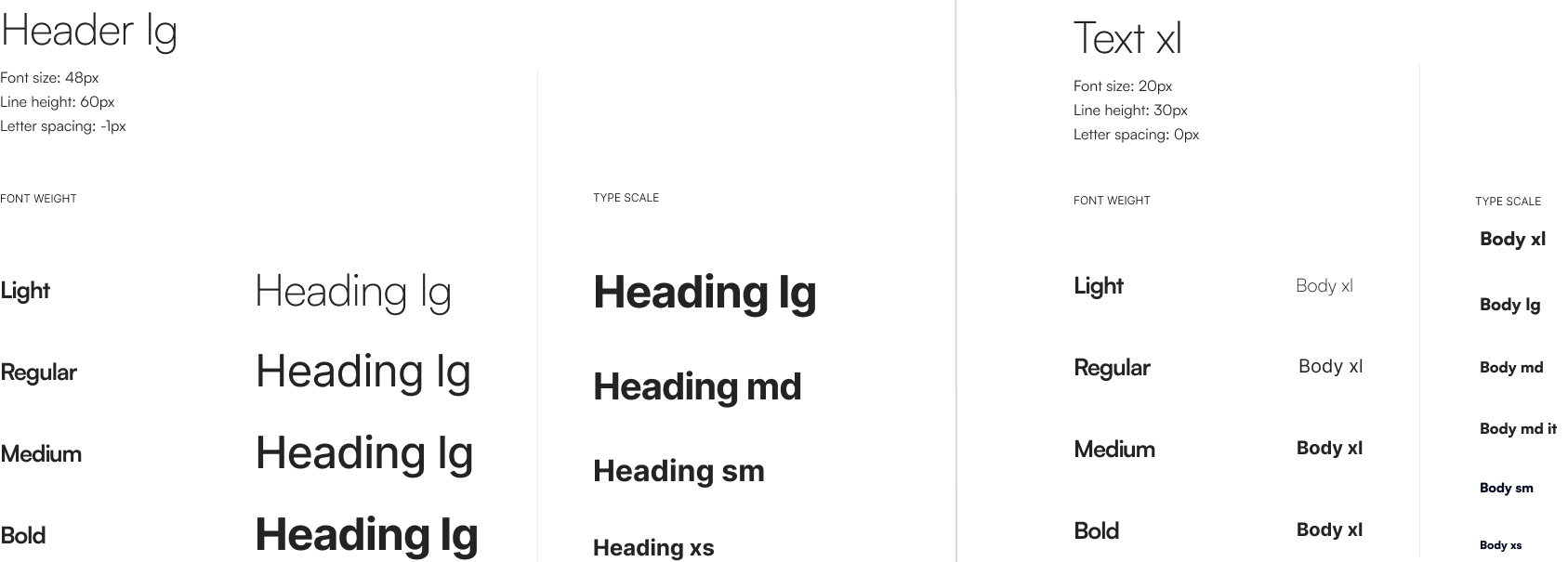
The primary brand color was Purple (500, #5614F3). I defined standard success, error, and warning colors to harmonize with the brand palette. I conducted accessibility checks for all colors, including their light and dark variants, and specified appropriate shades for use on various backgrounds.

I created design token variables for colors, padding, and spacing, ensuring consistent cascading updates across the design. To streamline the developer handoff, I established a clear naming convention aligned with the project's design system for seamless integration.

Alias Variables, children of global variables.These values are derived from global tokens, allowing them to automatically adapt to changes in the global variables. They are presented as Figma’s preferred property values, enabling quicker and more consistent application across components.

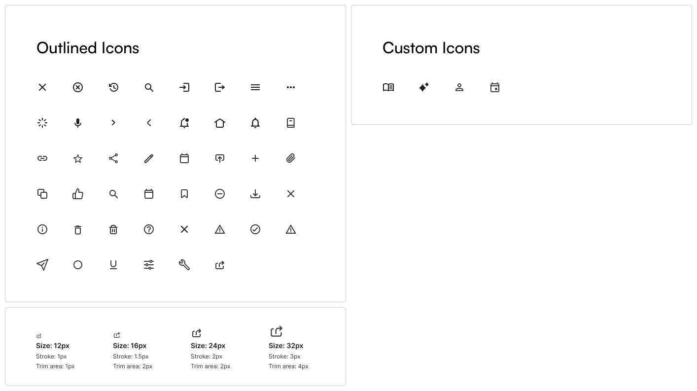
I utilized a pre-existing icon library from UI icons from Google's Material Design, added custom icons when needed, and created size variants as part of the design system atoms.
The components follow a cascading hierarchy: Atoms, Molecules, and Organisms. This structure ensures that changes made at the atomic level seamlessly propagate to higher-level components.
Atoms are the smallest building blocks, including buttons, tags, logos, and icon placeholders, forming the foundation for more complex UI elements.


A design system is never truly "finished", it's an evolving framework that requires continuous testing and refinement. As new components were implemented, it was crucial to assess their impact on the overall product. To validate the effectiveness of these updates, I collaborated closely with the UX and development team to gather insights on what worked well and where improvements were needed.
This iterative approach reinforced the importance of ongoing collaboration and validation, ensuring that the design system not only enhances efficiency but also scales effectively over time.

